How to build a simple dashboard
Connect to data
Power BI Desktop connects to many types of data sources, including local databases, worksheets, and data on cloud services. Sometimes when you gather data, it's not quite as structured, or clean, as you want it to be. To structure data, you can transform it, meaning that you can split and rename columns, change data types, and create relationships between columns.
You can connect Power BI Desktop to many types of data sources, including on-premises databases, Microsoft Excel workbooks, and cloud services. Currently, there are over 110 Power BI-specific connectors to cloud services such as GitHub and Marketo. You can also connect to generic sources through XML, CSV, text, and ODBC. Power BI will even extract tabular data directly from a website URL.
In this module, we will build out a dashboard for Contoso Manufacturing displaying their sales data for various products. To follow along with the next steps, visit https://docs.microsoft.com/power-bi/create-reports/sample-financial-download and download the financial sample workbook to your local files or One Drive. If this is your first time using Power BI Desktop, please visit https://docs.microsoft.com/power-bi/fundamentals/desktop-get-the-desktop for download instructions.
1.Start Power BI Desktop, and choose Get Data from the ribbon on the Home tab.
2.Choose Excel and press Connect.
3.Find the financial sample workbook which you downloaded and saved locally or to your OneDrive. Select the file and click Open.
4.A dialogue box with the tables in your data should open. Click the box next to the financials table. You will see a preview of the data displayed. Select Load.
You can now see that the fields have populated on the farthest right pane. You are currently in the report building tab. Select the data tab to see a preview of your data.
Build a dashboard
If you clicked on the link from publishing your report, your report should now be open in your browser. Let's use this report to create a dashboard.
1.Visit Page 2 of your report. Hover over the clustered column chart and a small push pin will appear in the upper right corner of your visual.
2.Press the pin.
3.In the dialogue box, make sure New Dashboard is selected. For the dashboard name, type "Contoso Manufacturing Sales". Select PIN.
4.Go to the first page of your report.
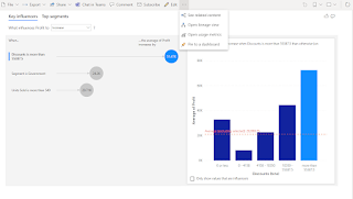
5.You may notice that Key Influencers does not have the option to pin the visual when you hover over it. Instead, press the Pin to a dashboard button at the top of your report.
6.In the dialogue box, make sure Existing Dashboard is selected. Ensure the dropdown shows "Contoso Manufacturing Sales". Select Pin Live.
7.A message will pop up with the option to Go to Dashboard. Click it.
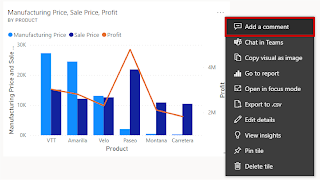
8.You should now see the tile and live page you pinned. You can think of a dashboard like a cork board. All of your pinned visuals exist in a one-page scrollable platform from which you can collaborate. Hover over the column chart tile and select the ellipses in the upper right corner.
9.Select Add a Comment. From here you can type specific comments and even call out individuals in your company by using the @ symbol.
10.Type a comment and then close the comments pane. You will notice that a small text bubble symbol has appeared by the title of the visual. Press it to see your comment appear.
11.Close the comment pane again. Select Edit, then select Add Tile.
12.Select Text Box.
13.Select Next.
14.Scroll down and add text. You can increase the font size or format the style. Select Apply.
15.The tile you just added is at the bottom of the report. Click and drag it to the top beside the column chart.
16.Hover over the visual and you will see two small lines at the bottom right corner. Click and drag them to resize the tile to be smaller (About a quarter the size of the column chart tile).
17.Click on the section Ask a question about your data.
18.A new pane will open over your dashboard where you can ask questions in real language of your data. Type "What is the largest gross sale". The resulting visual is known as a data card.
19.Select Pin Visual, and click Pin.
20.Exit Q&A.
21.The visual you created from the Q&A is at the bottom of your dashboard. Drag it up and resize it as you did with the text tile.
22.Select Web View in the top right and switch to Phone View.
23.Here you can change the size and order of tiles to view them better on mobile. Pin the text tile and data card tile to the mobile view and drag them to the top.
24.Unpin the live page tile and drag the column chart tile to be longer.


Comments
Post a Comment