Configure forms, charts, and dashboards in model driven apps
Model-driven apps
Model-driven app design is a component-focused approach to app development. Model-driven app design doesn’t require code and the apps you make can be simple or very complex. Unlike canvas app development where the designer has complete control over app layout, with model-driven apps much of the layout is determined for you and largely designated by the components you add to the app. Model-driven apps start with your data model – building up from the shape of your core business data and processes in the Dataverse to model forms, views, and other components. Model-driven apps automatically generate great UI that is responsive across devices.
Model-driven app design doesn’t require code and the apps you make can be simple or very complex. With model-driven apps, much of the layout is determined for you and largely designated by the components you add to the app.
Form
Custom Controls
Custom controls let you transform columns that traditionally contain text into visualizations. Similarly, you can use custom controls to transform datasets, such as a view, to display in a more visual rendering rather than a list of rows. Custom controls can appear as visualizations on forms, dashboards, views, and homepage grids. You can set one type of custom control to appear in the web browser client while having a different custom control appear in the phone or tablet mobile apps. For example, you could use a number input custom control for a column in web browser clients and a slider custom control for the phone app. After the customization is published, users can fully interact with the control to change the value, such as by sliding the control when using the linear slider custom control. Changes are automatically saved when the form is closed just as they are when the user changes a traditional column on a form.
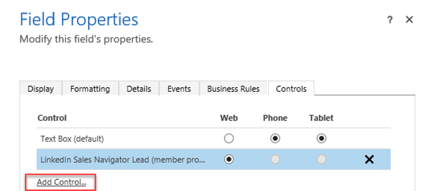
The following is an example showing on the Controls tab on column properties how you can configure a custom control.
The data type of the column determines what custom controls are available. Examples of custom controls include:
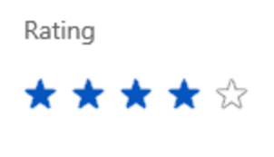
Choices
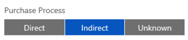
Flip switch

Linear slider

Radial knob

Star rating
Configure multiple forms
Users of model driven applications will encounter many forms in their user experience, and will even encounter different forms for the same table depending on their role, job tasks and desired outcomes.
You can set form order when using multiple forms. This will define the order in which a user sees the available forms, within the allowed forms for their security roles.

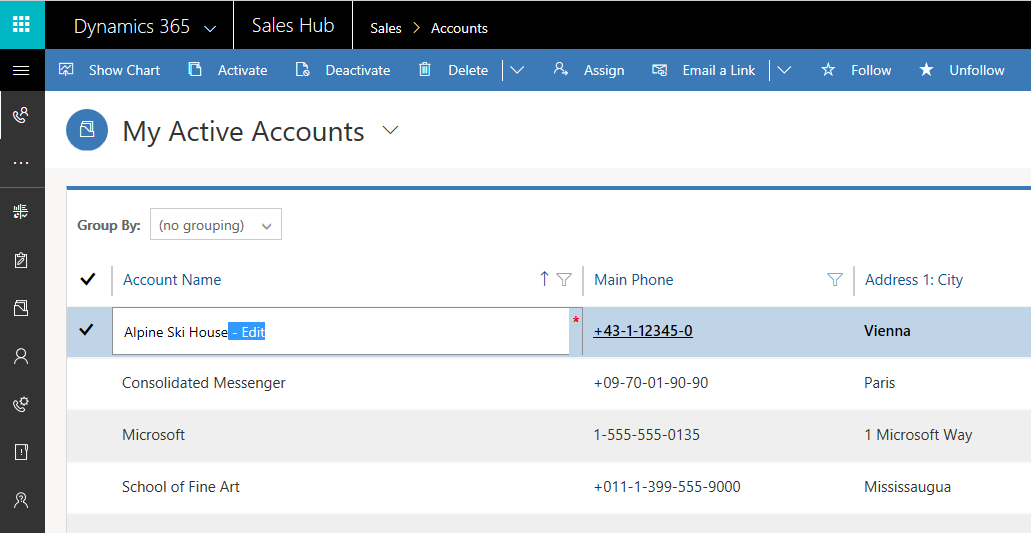
Configure grids
Editable Grids are special controls for editing select columns from a view without needing to open the specific row. This feature is available out of the box but must be added to the tables in Dynamics 365 for Customer Engagement. Editable Grids are available to use in views and as subgrids placed on forms. You cannot create new rows via the editable grid; you may only use it to update existing rows. These controls use the custom control framework.
Data changes made within the Editable Grid will have the same impact on Workflows and Business Rules with a scope of table or All Forms as if the same data changes were made on the form. AutoSave will complete as the user moves on to the next row in the grid.
In order to use editable grids, you will need to explicitly enable the feature for each table and enable each subgrid on a form.
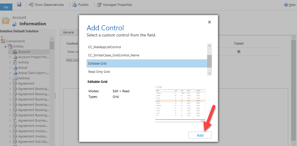
To enable the editable grids, you must first add the control on the table definition.
Once enabled you can perform direct inline editing of rows for rows of that table type.
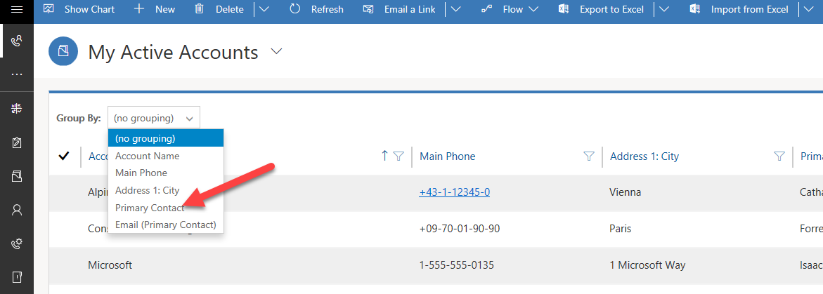
In addition to the ability to edit rows from the grid, you can also group rows.
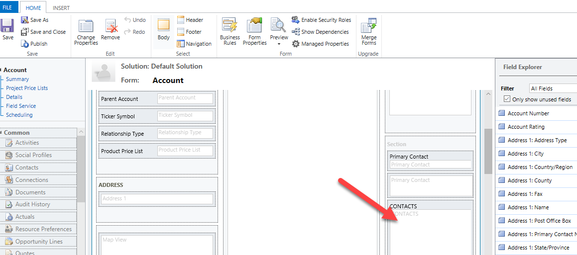
To enable an editable subgrid on a form, you must start from the form where the subgrid is located. In our example below, we are looking at the Contact subgrid on the Account form.
Double-click on the subgrid to open its properties.
On the Controls tab, select Add Control.
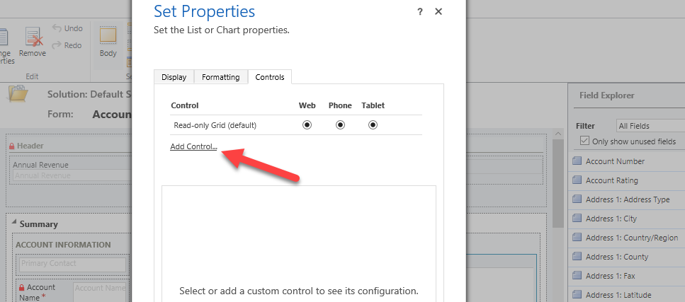
Select Editable Grid.
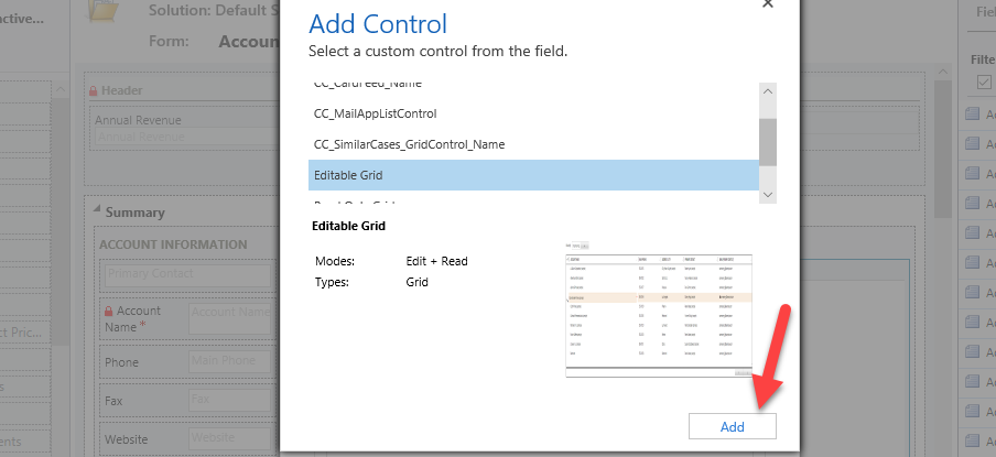
You will now have the same editable grid functionality available on the Contact subgrid on the Account form, including grouping. When the data changes from an editable subgrid are saved, the hosting form will not also execute a save. This means that the change that you made to the Contact row will save but an another save will not fire on the Account row.

Dashboards
Multi-stream dashboards
Multi-stream dashboards display data in real time over multiple streams. Each stream can be based on a different table, making them good for high-level overviews such as the Tier 1 Dashboard in the Customer Service hub.
To configure a multi-stream dashboard, you can choose from four different layouts:

The top tiles contain interactive charts that are referred to as Visual Filters. These charts display counts of relevant rows, and you can filter data contained within the dashboard by selecting different values contained within the charts.

Multi-stream dashboards also provide a Tile view which can be activated by selecting the Switch to Tile View button. This option toggles stream data into being displayed as interactive summary tiles that display the count of rows within each stream.

Single-stream dashboards
Single-stream dashboards display data in real time over a single stream. They enable a more detailed view of a given table, and as such are good for monitoring fewer but more complex data, as represented in the Tier 2 Dashboard of the Customer Service Hub.

For single-stream dashboards, you can choose from four different layouts:

Interactive tiles
Interactive tiles are useful for providing more detailed visual insights about your data. Using interactive tiles, you can:
Show aggregated view of data across queues/views
Select tile to drill to underlying rows
Interactive tiles provide an aggregated view of the information in the streams, across queues or views that interest you most. They help you monitor the volume of cases and quickly drill down to a particular row. In a multi-stream dashboard, you can switch from the standard view to the tile view by selecting Switch to Tile View button given in the command bar.
The content of each tile represents the count of the number of rows within that given stream. Hovering over the "View" text will show you from which view the tile's stream is being pulled. Selecting a tile will produce a flyout of the rows contained in the stream, which you are able to navigate to by selecting a given row.

Configuring interactive dashboard columns
Any table supported in Unified Interface can be enabled for interactive experience dashboards.
A supported column can be enabled for the interactive dashboard experience on its column settings:

Global Filter columns can be configured by setting the "Appears in global filter in interactive experience" flag on a given column. This will cause the column to appear in the global filter flyout window:

Sortable columns can be configured by setting the "Sortable in interactive experience dashboard" flag on a column. This will cause the column to appear in the flyout that appears when a user selects the "More" on the stream header.

Composing custom interactive dashboards
To compose a custom interactive dashboard, the following attributes must be set:
Filter table: The visual filters and global filter attributes are based on this table.
table View: The visual filters are based on this view.
Filter By: The column that the time frame filter applies to.
Time Frame: The default time frame filter value for the Filter By column.

Leverage the Add Component option to add interactive charts to your dashboard:

The Add Stream option is used to add interactive streams to your dashboard:


Comments
Post a Comment